Exploring the Iris Dataset: A Visual Analysis of Sepal and Petal Characteristics
By Kelvin Kiprono in ggplot2
November 12, 2024
To explore the iris dataset using ggplot2, you can create a variety of visualizations that help in understanding the relationships between different variables, such as scatter plots, box plots, and pair plots.
Here’s how you can get started:
Loading required package and data
library(ggplot2)
data("iris")
head(iris)
##   Sepal.Length Sepal.Width Petal.Length Petal.Width Species
## 1          5.1         3.5          1.4         0.2  setosa
## 2          4.9         3.0          1.4         0.2  setosa
## 3          4.7         3.2          1.3         0.2  setosa
## 4          4.6         3.1          1.5         0.2  setosa
## 5          5.0         3.6          1.4         0.2  setosa
## 6          5.4         3.9          1.7         0.4  setosa
str(iris)
## 'data.frame':	150 obs. of  5 variables:
##  $ Sepal.Length: num  5.1 4.9 4.7 4.6 5 5.4 4.6 5 4.4 4.9 ...
##  $ Sepal.Width : num  3.5 3 3.2 3.1 3.6 3.9 3.4 3.4 2.9 3.1 ...
##  $ Petal.Length: num  1.4 1.4 1.3 1.5 1.4 1.7 1.4 1.5 1.4 1.5 ...
##  $ Petal.Width : num  0.2 0.2 0.2 0.2 0.2 0.4 0.3 0.2 0.2 0.1 ...
##  $ Species     : Factor w/ 3 levels "setosa","versicolor",..: 1 1 1 1 1 1 1 1 1 1 ...
summary(iris)
##   Sepal.Length    Sepal.Width     Petal.Length    Petal.Width
##  Min.   :4.300   Min.   :2.000   Min.   :1.000   Min.   :0.100
##  1st Qu.:5.100   1st Qu.:2.800   1st Qu.:1.600   1st Qu.:0.300
##  Median :5.800   Median :3.000   Median :4.350   Median :1.300
##  Mean   :5.843   Mean   :3.057   Mean   :3.758   Mean   :1.199
##  3rd Qu.:6.400   3rd Qu.:3.300   3rd Qu.:5.100   3rd Qu.:1.800
##  Max.   :7.900   Max.   :4.400   Max.   :6.900   Max.   :2.500
##        Species
##  setosa    :50
##  versicolor:50
##  virginica :50
##
##
##
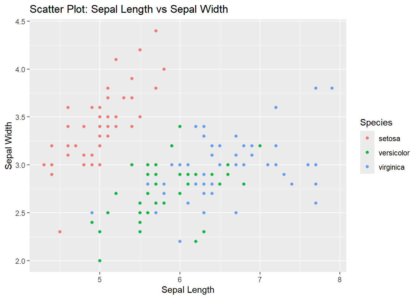
Scatter Plot: Sepal Length vs. Sepal Width
ggplot(iris, aes(x = Sepal.Length, y = Sepal.Width, color = Species)) +
  geom_point() +
  labs(title = "Scatter Plot: Sepal Length vs Sepal Width",
       x = "Sepal Length",
       y = "Sepal Width")
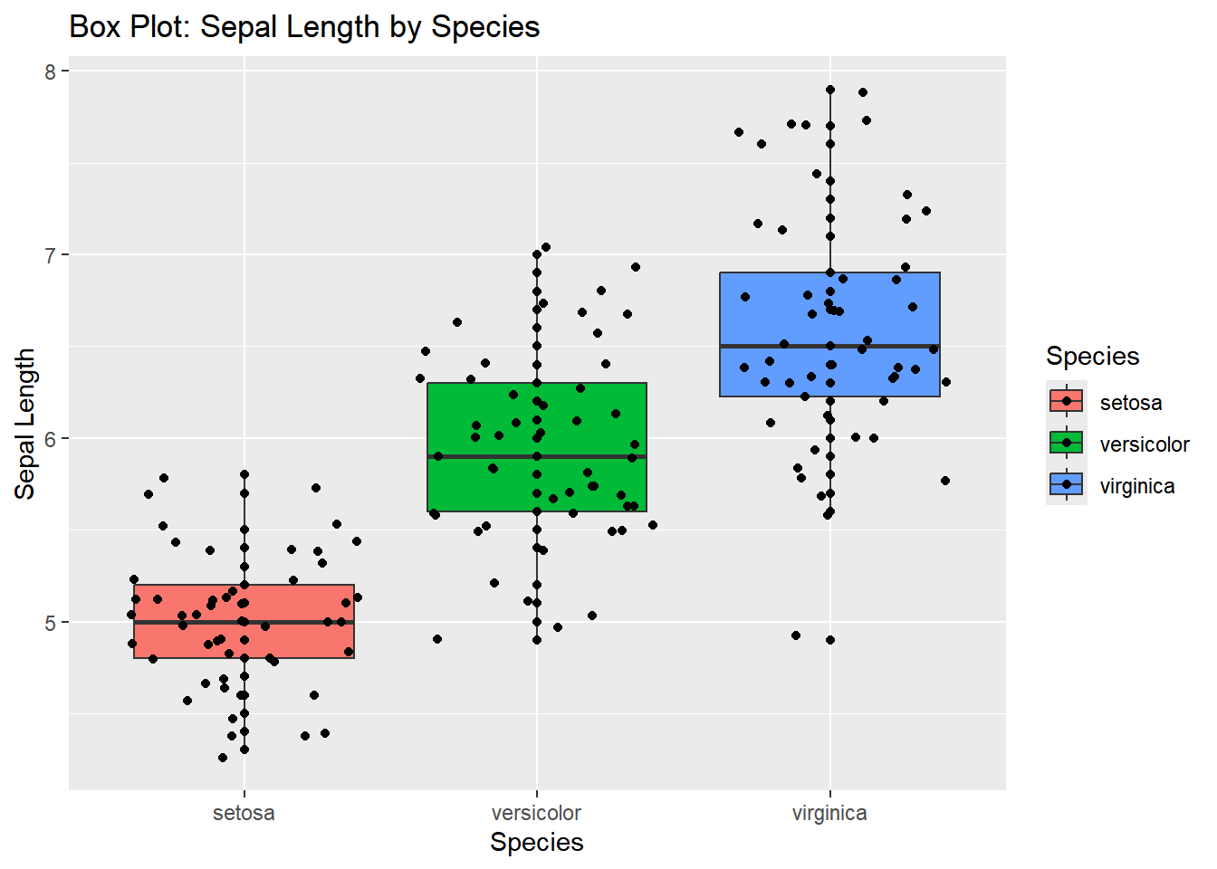
Box Plot: Sepal Length by Species
A box plot can be useful to examine the distribution of Sepal.Length across the different species of iris.
ggplot(iris, aes(x = Species, y = Sepal.Length, fill = Species)) +
  geom_boxplot() +
  geom_point()+
  geom_jitter()+
  labs(title = "Box Plot: Sepal Length by Species",
       x = "Species",
       y = "Sepal Length")
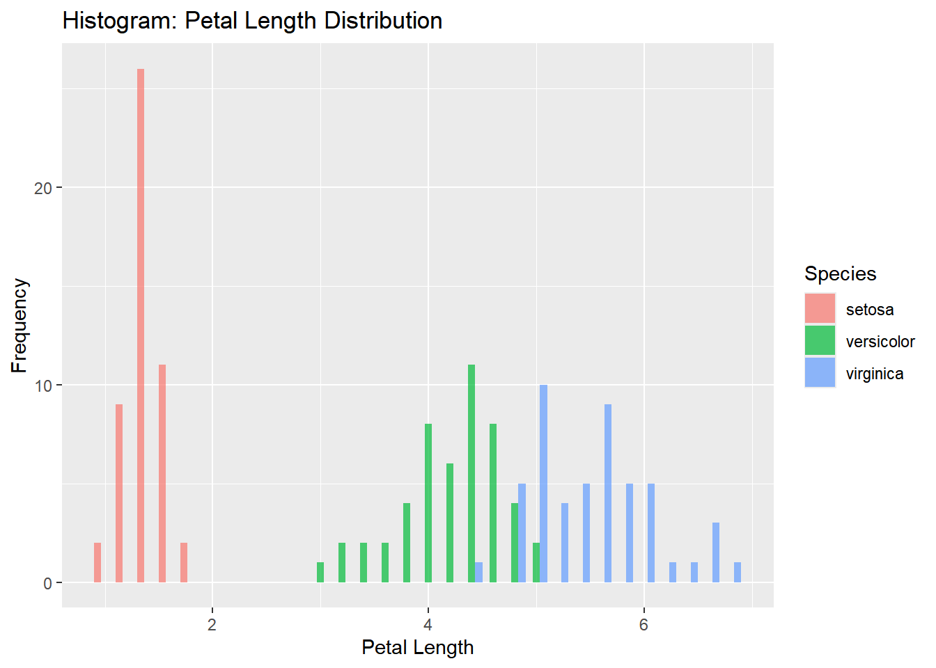
Histogram: Petal Length Distribution
A histogram can help visualize the distribution of Petal.Length across the dataset. You can also use the fill argument to color the bars by species.
ggplot(iris, aes(x = Petal.Length, fill = Species)) +
  geom_histogram(binwidth = 0.2, alpha = 0.7, position = "dodge") +
  labs(title = "Histogram: Petal Length Distribution",
       x = "Petal Length",
       y = "Frequency")
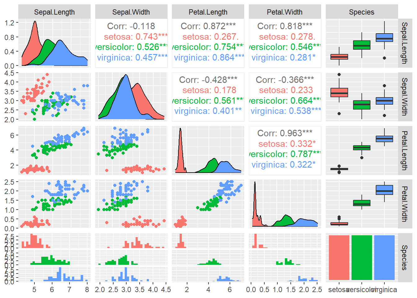
Pair Plot (Pairwise Relationships Between Variables)
A pair plot (also known as a pairs plot) visualizes pairwise relationships between multiple variables in the dataset. You can use GGally::ggpairs() for this, but here’s a basic ggplot solution for just two variables.
library(GGally)
## Warning: package 'GGally' was built under R version 4.4.2
## Registered S3 method overwritten by 'GGally':
##   method from
##   +.gg   ggplot2
ggpairs(iris, aes(color = Species))
## `stat_bin()` using `bins = 30`. Pick better value with `binwidth`.
## `stat_bin()` using `bins = 30`. Pick better value with `binwidth`.
## `stat_bin()` using `bins = 30`. Pick better value with `binwidth`.
## `stat_bin()` using `bins = 30`. Pick better value with `binwidth`.
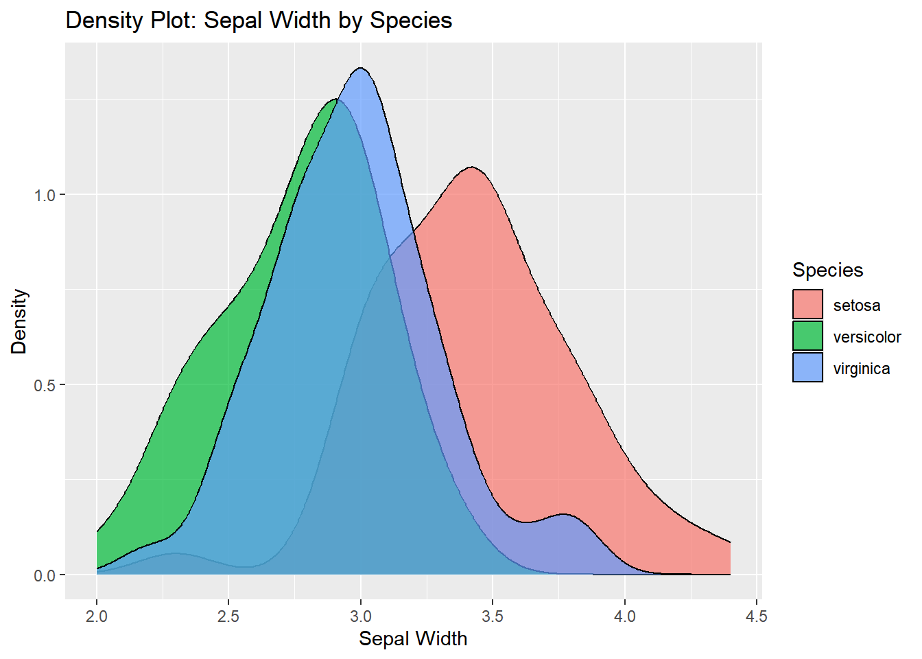
Density Plot: Sepal Width by Species
A density plot can show the distribution of Sepal.Width across different species. This is an alternative to the histogram.
ggplot(iris, aes(x = Sepal.Width, fill = Species)) +
  geom_density(alpha = 0.7) +
  labs(title = "Density Plot: Sepal Width by Species",
       x = "Sepal Width",
       y = "Density")
Faceted Plot
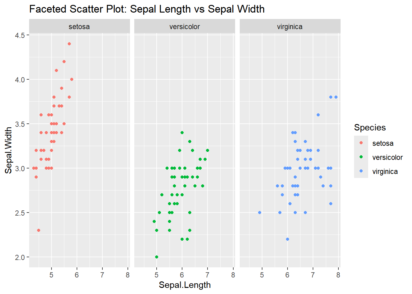
Faceting allows you to create multiple subplots based on a factor (e.g., Species). Here’s how you can create separate scatter plots for each species:
ggplot(iris, aes(x = Sepal.Length, y = Sepal.Width)) +
  geom_point(aes(color = Species)) +
  facet_wrap(~ Species) +
  labs(title = "Faceted Scatter Plot: Sepal Length vs Sepal Width")
Correlation Heatmap
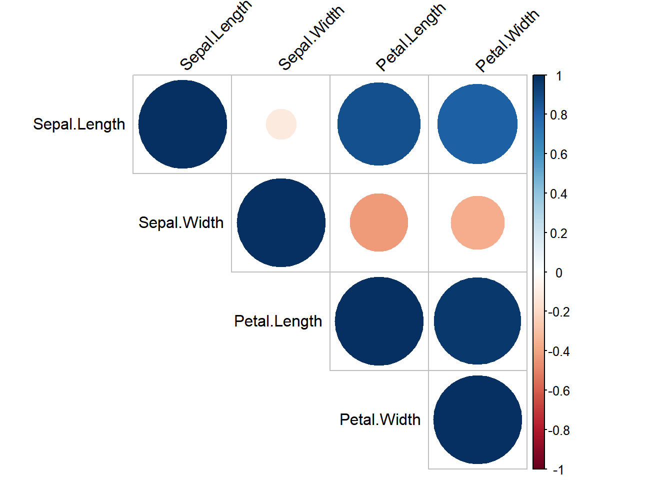
To visualize the correlation between numerical variables in the iris dataset, you can use a correlation heatmap.
library(corrplot)
## corrplot 0.94 loaded
# Correlation matrix
cor_matrix <- cor(iris[, 1:4])
corrplot(cor_matrix, method = "circle", type = "upper", tl.col = "black", tl.srt = 45)
 With ggplot2, you can easily generate a variety of insightful plots to explore the iris dataset and understand the relationships between different variables.